Dear Moderator,

This is my A2 Media Blog. Hope you enjoy it!

You will find my final teaser trailer, film magazine and film poster just under this note. My research and planning began in September. My evaluation is just under my final product too.

Thanks!
Louise.

Friday 20 April 2012

Research & Planning: Final Products

This post has my final teaser trailer, 'Verdict', film magazine, Cinematic and film poster for Verdict.


Wednesday 21 March 2012

Evaluation Question 4

Evaluation
Question 4

How did you use media technologies in the construction and research, planning and evaluation stages?

Media Technologies: Blogger, Internet, Imovie, Garageband, Prezi, Slideshare, IShowU, Photoshop, Microsoft Excel, Powerpoint, SLR Cameras, Sony Cameras, Camcorders. 


Research & Planning: Blogger, Internet, Prezi, Powerpoint, Excel.


Blogger was a main media technology that I used for my research and planning as this is what I used to document everything that I was researching and analysing. I also used Blogger last year for my research so I was very familiar with how to use it therefore I felt more confident with doing more individual posts and being more experimental with it. I put all of my progress onto my blogger and I could easily go back and look at previous research as well as work out what I had to do next. Using Blogger allowed me to get audience feedback off people in my class through comments.


All of my internet research has come in very useful when it has come to producing my three media pieces. I used the internet throughout the year to do different research on other teaser trailers, magazines and posters to see the conventions of them and also to use them as an influence. The internet allowed me to use products such as Blogger and Prezi. The internet has also helped a lot with genre research and using Youtube for trailers. I have also used it to look at the top horror films on IMDB and I have even used it to research courts and jurys for my storyline for my teaser trailer as it has helped me to get accurate information about specific things such as how many people would be in a jury.


I have used Prezi to make a presentation about who I wanted as my target audience. I have also used Prezi to do some digital technology research. This programme proved to be useful as it is easy to use and easy to set out my ideas in an organised, viewable way. I could also edit my Prezi at any time if I wanted to make any changes which is helpful too. I used Prezi last year so I was fully aware this year of how to use it, therefore, the process of using this was very quick.


Microsoft Powerpoint was used at the beginning of my research because this is what I made my Pitch on and I then resulted into using Slideshare to upload this onto my Blogger. Powerpoint is very useful and it is simple and quick to use so I got my research done in no time when it came to using Powerpoint. I also used this for the pie charts that I did for my questionnaire research.


Microsoft Excel was used to create my Production Schedule at the beginning of the year which meant me writing out all of the tasks that I had to do and complete by certain dates regarding my trailer, poster and magazine. It helped me to stay organised because I uploaded it onto my Blog so that I could keep looking back at it to see where I was up to with my progress and what I had to do next. Excel was very easy to use as I used this last year too when it came to creating my Production Schedule.

Construction: SLR Cameras, Mini DV Camcorders, Imovie, Garageband, Photoshop, IShowU, Sony Cameras.

The SLR Camera was used again this year for the same reason as last year, to take good quality photographs for my magazine and poster. Although last year I needed images for my music magazine, this year I needed images for a film magazine and a film poster. Due to using them last year, I felt confident in using them this year and they were much easier to use. I became more aware of different shot types and the use of locations and lighting and which worked best. My pictures ended up looking better and more effective for my magazine and poster.

The Mini DV Camcorders were used to film the scenes for our teaser trailer. Although I did not use them last year, I soon became familiar with how to use one and they then became simple and easy to use. Me and my partner were also given our own tape to use each time we filmed a part of our trailer which helped because then all of our footage was on one tape and not a lot. For the majority of the trailer, I also used a tripod which was also easy to use, to help with the steadiness of the camcorder to get clear, still scenes. Numerous scenes had to be refilmed or filmed a lot of times to see which clip was the best. I learnt more about different camera angles and I experimented with the camcorder to see which angles and shots looked better and suited a horror genre.


IMovie was one of the main constructive technologies used and this is what my teaser trailer was imported on to. I had not really used it before apart from small tasks last year but, it was simple to use and I soon managed to use it easily enough again. The use of IMovie allowed me to upload all of my footage and it allowed me to choose which clips I liked the best to use but it still kept all of my raw footage too in case I ever wanted to add anything later on. It also helped with the editing as the editing transactions that it included helped me and my partner a lot when it came to editing our trailer. It also allowed me to add sound to my trailer and even make some adjustments to the cinematography such as cropping certain scenes.


Garageband is something that was introduced to me this year. I found this programme a bit more difficult to use and it took me a while to get used to it. I had to experiment around a lot with sound to see what each sound was like and how to use the different tools. We did a small task at the beginning of the year and we had to use GarageBand so when it came to my main teaser trailer it was a little bit more easier to use. Sound was created in here to add to the teaser trailer to add tension and to create the horror effect.

Photoshop was another main programme that I used this year. I used Photoshop to create my film magazine and poster. I used Photoshop last year to create my music magazine front cover, contents page and double page spread so I knew how to fully use Photoshop in my second year. At the beginning of the year we did a task to remind oursleves how to use is which was helpful because some bits I had forgotton how to use. I created my film magazine and poster easily and quickly because I had the knowledge of Photoshop. A lot of changes had been made to my poster and magazine but I could easily make these big changes because I knew that I could sort them out quick enough to a good standard.
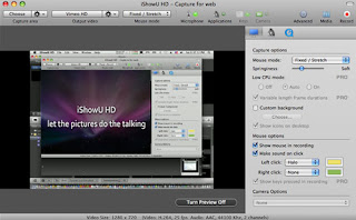
IShowU was used to make videos of me doing my work. I made one which is just of me working on my film magazine and poster to show how I was making it and what I was doing. It has helped a lot this year when it has come to the Evaluations as different technologies such as IShowU are needed to evaluate some of my work. I used this programme last year for the same reasons as this year. I find it very easy to use and I found it easy to use last year. It is a very simple but useful programme to show my progress.


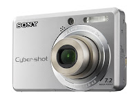
A normal Sony digital camera was used to take simple pictures of my location, props and costumes to add onto my Blog for more research and to show what I have done. The cameras are very easy to use and they were used last year for the same reasons. They are very easy and quick and produce good quality photographs. 


Evaluation Question 3

Evaluation
Question 3

What have you learnt from your audience feedback?

For this question, I had to look at all of my feedback that I had done throughout all of my research and Planning and analysed why it has helped my produce my film teaser trailer, film magazine and film poster.


Interviews
I interviewed a few people in my class and these were to find out what they thought the typical codes and conventions of a media trailer were. I also asked them questions on what they thought differentiated a full length trailer to a teaser trailer and also about what certificate they thought the best horror films were. I also asked what their own favourite horror film was. All of this was very useful as I got to find out each person's own individual ideas and compared them to what other people had said.

Questionnaires
Questionnaires were handed out to my media class. My questions focused on mine & Nathan's chosen genre which was horror. We included questions about horror teaser trailers and what people expect from them and what they think the main conventions are and what people like about horror films. This all helped me to create a Pitch on Powerpoint once I had collected all of my information.

Proposals
The proposals consisted of three ideas that me & Nathan thought about for what the storyline of our trailer could be. The mise-en-scene, cinematography, editing and sound was discussed for each idea and then we thought about which idea to use as our final storyline. Twitter and Facebook feedback helped us a lot with this as me and Nathan each asked people on these social networking sites which they thought was a better plot idea and people commented back to us to tell us what they personally thought. From this feedback, me and Nathan then knew which direction to go in when it came to our storyline.

Production Logos
When it came to creating our production logos, I drew out 6 drafts of different ideas for the logos. We then put them onto to Powerpoint and highlighted which ones me and Nathan personally liked the best. We then asked people in our class for their feedback on what they liked the best so this feedback was helpful as it helped us to decided which ones to use.

Teacher Feedback
The feedback that I got from my media teacher was really useful throughout the entire production of the trailer and my magazine and poster. This was helpful because Angela helped me and Nathan to stay on the right track thoughout and she gave us feedback on what she thought would work best when it came to all of our productions.

Teaser Trailer Feedback
This was really helpful as we each gave the people in our class a sheet of paper with some questions on and they all answered questions about the narrative, genre, strengths and areas of development. Everyone gave us some really positive feedback about what they thought were the good parts and they helped us by suggesting ways in which we can improve it.

Poster & Magazine Feedback
This was done similarly to our feedback from the class for our trailer with the sheets of paper with questions on about the genre, narrative, strengths of each and areas of development for each. This was useful because it helped me to see how I could improve my magazine and poster to make them look better.


Evaluation Question 2

Evaluation
Question 2

How effective is the combination of your main product and ancillary tasks?


Script


Evaluation Question 1

Evaluation
Question 1

In what ways does your media products use, develop and challenge forms and conventions of real media texts?

Teaser Trailer
Use
- For our teaser trailer me and Nathan used some conventions of our trailer from possession film 'Exorcism of Emily Rose'. The storyline our of trailer is similar to that of 'The Exorcism of Emily Rose' because of the possession and court scene storyline.
Our blood on the wall scene was influenced by 'The Strangers' as there is a scene in that which has a blood on the wall scene. We thought that this was a good horror effect and would work well to use as some peaks in the trailer. From the The Strangers we also took the idea of the word 'hello' being written on the window as this creates a horror effect. We have also used the idea of showing the swings swinging with no one sat on them as this creates tension. We also used the knife scene in our trailer from the old horror movie 'Psycho' as there is the iconic knife scene in that when the main character is being killed in the shower. We thought that this would create a fear for the audience if we showed a glimpse of a knife with blood on it.
Other possession films such as 'The Exorcist, An American Haunting and The Exorcism of Emily Rose' all have female characters becoming possessed. We decided to stick to this idea of having a female possessed as this is typical and creates fear.
We have used scenes to show our Jury member becoming possessed just like in other trailers where there are scenes to show that a character has been possessed.
Also from 'The Exorcism of Emily Rose' we used the idea of putting text onto our trailer so we used the 'based on a true story' idea. We also added more text about the court case and the character who got possessed just like in 'The Exorcism of Emily Rose' again as we thought this was a good idea that developed the narrative a bit more and it seemed conventional for a horror film.
When it came to mise-en-scene, we used costume ideas of what the Jury should look like from our research of other films and also we had the typical red coat for the Judge to show that she was a Judge. We even had the prop of the gavel to show this.
The make-up that we used as well was influence by the make-up used on the girl in 'The Exorcist' as we wanted that scary feeling and we wanted it to look realistic so the audience would believe that our character had been possessed.


Develop - Not only did we use the blood on the wall scene from 'The Strangers' we developed this though as well by using the blood on a bathroom mirror and writing the words 'help me!' on the mirror with blood which creates the horror effect. As a part of our storyline, we developed the usual possession storylines of demons possessing people and used a murdered young girl as the spirit that possesses one of the Jury members.
We have developed the scene from The Strangers of the 'hello' written on the window by using the words 'help me!' written on a mirror instead and we developed this even further by writing it on the mirror using fake blood.
We developed our jury scene by just showing the Jury itself and using a pan across the members on each row to show this. We developed from the court scene on 'The Exorcism of Emily Rose' as ours is similar but we have chosen only to show the Jury as they are characters in our trailer rather than showing the actual court case.
Me and Nathan also developed the swing scene as we filmed it in daylight but we changed the lighting of it to make it darker on IMovie. Even though this is the same to The Strangers, we feel like we have developed it more by adding the different light effects to it. We also did the same with the knife scene to develop the clip of it a bit more. The lower key lighting also added more to the typical horror effect.
Our storyline was even slightly developed from other typical possession films as this time instead of a demon or some form of paranormal activity possessing the girl, we decided to have a murdered little girl possessing our protagonist for the sake of her getting revenge from the person who originally murdered her.


Challenge - We kept our storyline slightly similar to The Exorcism of Emily Rose by using the court case but we challenged this by only showing the Jury in the court and not the actual court case. we also challenged it by using a news report of what the case is about.
We also challenged by having a member of the Jury become possessed which has not been done in any of the trailers that we have looked at.
We challenged the stereotypical role of using a male Judge for our Gavel scene and voiceovers too as we used a female which is rare to see when it comes to court cases.
We have challenged stereotypes as we have a female villain which isn't usually seen however it is usually females who tend to get possessed in films as shown in 'The Exorcism of Emily Rose' and 'The Exorcist'.
Our trailer was challenged again as we added in a news report scene to add more information about the case and to make it seem realistic to the audience. A news report scene hasn't been shown in any other teaser trailers that we have looked at that are similar to our narrative.
With our soundtrack that we added to the trailer, we challenged as our sound isn't really similar to any other used in a teaser trailer. We wanted to keep some of the sound consistent throughout so that there wasn't too many sound effects going off at once which could ruin the effect of the trailer. We had voiceovers in there too along with the sound to create the horror effect and we had our sound similar in the trailer at the beginning and at the end to introduce and fade out but we kept them consistent.

Again, we challenged our trailer by using a montage of the Jury using an ouija board and of the victims of the possessed girl. We challenged this as a montage is not really seen in other trailer of people using Ouija Boards to find anwers as well as using flashbacks of Katy Leigh to show her saying that she can't escape. This again creates a horror effect.


Film Magazine
Use
- For my film magazine I used the Public Enemies issue of Empire magazine to create a similar layout. I have also used the same colours of red, white and black not only because they are used on this magazine but also because they are typical horror colours and my magazine was showing the horror film 'Verdict'.
I even included images on my magazine where the images are visible on the Empire magazine so I used this idea for my magazine so that there were more features included. I also like the look of the layout which is another reason that I chose this magazine as my influence as I thought that it stood out from other magazines.
The added information at the bottom of Empire I also used to influence my magazine as I did the same at the bottom to add some extra features onto magazine.
I also put my barcode in the same place at the bottom right side and put the issue number, price and website there just like it is on Empire. I thought that this looked very professional therefore I used this on mine.
I used the colour grey for the main name on my story as well just like on Empire where the colour grey was used for the name of the film. I felt like this colour stood out more but also it was the best colour to use as other colours that I used such as red and black were not very visible when they were on top of the main image that I had chosen.

Develop -Where the added information is at the bottom of Empire magazine, I used this on my magazine too but developed it by only using other film names whereas on Empire it included actors names and projects. For Empire's 'Heroes of 2010' I have developed this by using 'Horrors of 2012' to make my magazine more based about horrors because the image on my front cover is for my Verdict trailer and the image is of Amy possessed.
For the added feature at the top I used but developed again from Empire magazine as on Empire the feature is 'Harry Potter 6: On set exclusive' so I have developed mine and added my feature as 'Is 3D here to stay? Cinematic's take on the latest films.' This is to make it different and modernise it.
I have placed my image in the same place as Johnny Depp has been placed on Empire but each picture is completely different as the genre of the films on my magazine and Empire is different. 


Challenge -Things that I have done differently from Empire magazine is the location of the website, mine is just above my barcode and on Empire it is just underneath the masthead.
The background on my magazine is completely different because I have used a gradient to create a more horror genre effect for the background of my image as it is dark.
All of my fonts are different from Empire. I have chosen my own fonts for my masthead, film title and for my other features.
I also have not used a circle of information next to my picture like on the Empire magazine where there is a circle containing informaion about the Ghostbusters film. I felt that if I did that it would cut a fair bit of my image off and it would look like too much has been put on my magazine then.


Film Poster
Use - For my film poster I have used typical conventions from other film posters when it comes to the cast and crew information and even using the steeltongs font for that information. This is seen on all film posters so I had to include this on mine.
The title of my film 'Verdict' is the main feature that you see on my poster which is what other film posters are like as the title has to grab the attention of the audience. I also have a tagline of the film 'Nothing stays dead and buried' which is sometimes included on film posters too.
'Coming soon' was included on my poster which does not reveal the date but shows to the audience that the film will be out soon and could leave the audience wanting to watch the film.
I have also included the production and distribution company logos on my poster as after researching different film posters I saw that this is conventional of a film poster and it is conventional to have them on either side of the cast and crew information.
I included a horror image on my poster to show the genre to the audience which is also usually typical of a film poster. The image is of the main character in her possessed form which illustrates that the film genre is horror as well as it showing that it is a possession film.
The colours that I have used are also conventional of a horror as I used black and red to create the horror genre in my poster.


Develop - I developed some ideas of a film poster as I changed the idea of using actors names on there and used the date, price of newspaper and title of the newspaper to show the fact that my poster is a newspaper. I also didn't include actors names because it gave the film a more realistic approach as the film is based on a true story.
I tried to stick to the typical conventions of a newspaper by having a title, columned information, image, price and date but I developed this too by using these conventions to create a film poster instead.
I developed again by not having my image as the main thing that the audience usually see first, the audience on mine will see both the film title and the newspaper title first and see the newspaper layout as my image is not taking up the whole of the poster so therefore it is not the main feature.


Challenge - For my film poster I have challenged the layout by using a newspaper style to advertise the film. It is set out exactly like an older newspaper with the newspaper title, title of the film, image and also some text, set out in columns like in a newspaper, to add some parts of information about the storyline without giving too much away.
I added a fair bit of text to my poster to set it out in columns like a newspaper and used some information to talk about the film without giving too much of the film away but I gave enough information to make people want to watch the film. I didn't include a lot of text either though as this could put the audience off as they do not want to read it or get a chance to read it.
My film poster is not based on any other film poster that I have seen so I challenged by going for this different layout. The newspaper layout I thought also gave the film  the sense that it is a real recorded event because the film is based on a true story.
I used a darker sepia colour to show that the newspaper is a few years old now and by the colour the audience will be able to tell this.


Monday 12 March 2012

Research & Planning: Final Film Magazine


This is my final film magazine for media studies. I used Empire magazine, the Public Enemies issue, to influence how I did the layout for my magazine. I used the 5 images on there to add extra features. I used the colours red, black and white but I had to use the colour grey for 'Amy Leigh' as due to her costume it was difficult to see any other colours on there.
I used a dark gradient on the background to give it more of a horror look to it and to also hide the white background. 
I included titles of films at the bottom to show what other films are included in the magazine. I also included a feature at the top of my magazine along with an image too to show what else is included in the magazine.
For my 'Horrors of 2012' feature, I took my images of props and actors and used the titles from the trailers that people in my class made.
As 'Verdict' is the main feature, I used a bigger image of the main protagonist possessed to show that it is a horror and also it is the actor who is being interviewed in the magazine which is shown to the audience by the information given.

Saturday 10 March 2012

Research & Planning: Final Film Poster


This is my final film poster. I chose to make it a newspaper article as it would be something more unique and interesting. A newspaper article would suit my storyline as it is based on a true event and it is to do with a court scene which often can get recorded on newspaper articles. 
I changed the colour of the newspaper to make it look a bit more older as the case is a few years old. 
I set some information out about the storyline in columns just like a newspaper and I didn't give too much of the plot away as it is only a poster. 
I added an image on of Amy possessed by Katie Leigh to show to the audience the main protagonist.
I also added things on such as cast & crew information in steeltongs and the 'coming soon' and 'based on a true story' information which is conventional of a media text. Even our production and distribution company logos are on there just like they are on other film posters.
I kept the colour red in there at some points to keep the horror theme and to show to the audience that it is a horror film rather than a documentary.
I stayed conventional to newspaper articles as well to make it more believable to the audience. I added a newspaper title, date and price.


Friday 9 March 2012

Research & Planning: Magazine Update


This is my updated film magazine. I have used the influence of Empire magazine to create the layout. I have changed my image and I am going to add three more images to advertise other films. I also used a gradient for the background and changed the font for Verdict and the colour.

Research & Planning: IShowU of Cloning Hair

This is my IShowU showing me editing my film magazine by cloning parts of Amy's hair and then adding it to thinner parts of her hair to make it thicker and to hide parts of the old background where I cut her out.

Research & Planning: Raw Film Footage

This is my film footage so far, We have done all of our filming and we have done majority of our editing. We might change the order of some scenes and change some editing transitions yet.
One thing that we haven't done yet is our soundtrack. We have been on Garageband to experiment with different instruments and sounds but we haven't actually chosen the ideal sound yet to suit our trailer. We are planning on having the sound of the gavel hitting the desk throughout the trailer as background noise.
We will most likely include some other sounds in there too. We have a couple of voiceovers of the Judge taking to the Jury to add the court effect. We also have speech from the characters themselves such as when they jury are taking part in the Ouija Board scenes. We also haven't decided yet if we are using voiceovers for 'Verdict' or 'Coming Soon'.

Thursday 8 March 2012

Research & Planning: IShowU of Editing


This is mine and Nathan's IShowU video that we took when we was editing our teaser trailer to show what editing changes we was making to our trailer.

Research & Planning: Film Magazine Update


This is my updated film magazine. It is not quite finished yet.
I might change the image yet as she doesn't look possessed, she looks more like she has been beaten up.
I am keeping the Masthead style and the colour theme. I may change the layout slightly too but not too much. I am also keeping the feature about 3D cinema at the top of my magazine with the image.

Wednesday 7 March 2012

Research & Planning: Film Poster Update


This is my film poster which is pretty much finished now. I may have to look at other ways to improve it.

Research & Planning: Film Magazine Update

This is my updated film magazine, I have added an image to it now but I still might not use this picture when I complete it.

Research & Planning: IShowU Video of Work in Class


This is my IShowU that I did in class while I was just doing some work to my poster and some work on my blog.

Research & Planning: Images for Magazine


This is one image that I have used for on the cover of my film magazine. I used this as an image for a feature that I have done which is about 3D cinema. 


Research & Planning: Image for Poster


This is the image that I have chosen for my poster. I will be using it as my image on the newspaper report which is how my poster is set out. I thought this image clearly showed the girl in her possessed state due to the make up. She is also in her costume that she wears in the trailer.
The shot type makes her look scary and intimidating as well.

Sunday 4 March 2012

Research & Planning: Sound Research


This is the trailer from the film 'The Exorcism of Emily Rose'. I have chosen this trailer to look at because I like the sound used this trailer. The storyline is very similar to mine and Nathan's trailer so I think that the sound is suitable for our genre.
We want to try and create something similar to this. We already have dialogue in our trailer from the characters speaking which is similar to this trailer.
One thing that we want as sound in our trailer that differs from this trailer is the sound of the gavel banging down onto the desk. This gives the court scene effect and it is also quite a scary sound to relate to a horror.

Friday 24 February 2012

Research & Planning: Digital Technology Prezi


This is my prezi to show my progress of using digital technology from my AS year to my A2 year. I have stated what technologies I have used and progressed onto using and how I have used them.

Wednesday 22 February 2012

Research & Planning: Verdict Teaser Trailer so far


This is my teaser trailer so far, we have added on our text for Verdict with our font as well as for 'coming soon'.

Research & Planning: Shot List Plan for Filming

Me & Nathan are filming the rest of our trailer at the end of the week so we are planning what shot types our last scenes need to be.

  • Birds Eye View shot of Jury around the Ouija Board.
  • Low angle shot of victim on the floor crawling away. 
  • Long shot of victims running down the corridor.
  • Close up of gavel.
  • Medium Close up of victim crying.

Tuesday 14 February 2012

Research & Planning: Film Poster Update


This is my film poster now. I have decided to go for something different than what I was already doing for my poster to make it more interesting and different. So I decided to make it into a newspaper article. I discoloured the page to make it look like an older article and added coloumns and wrote part of the story without giving too much of the film away. I still kept the website and cast and crew information on as they are found on all film posters. I added some red around my title to still give it that horror genre sense to it. I also have the image of Amy as the possessed girl as well so people can see what it is about.

Research & Planning: Film Magazine Update


This is my new update for my film magazine. I have added a different title as the other one seemed a bit too complicated and usually titles on film magazines are a lot more simpler but effective. I decided to go for red because it stands out a lot more. I even added text at the top for a feature along with an image about 3D movies.

Research & Planning: Film Magazine Update


This is my film magazine update where I have added text at the top and I have also deleted the main image as I am thinking of taking a new one photo.

Research & Planning: Film Magazine Influence


This is my film magazine influence. I have chosen this as I like the colour theme as well as the layout and the main image. I have decided to use this magazine as a guidline for creating my film magazine.

Research & Planning: Other Film Magazine Pictures


These are some images that I took as an extra image for a feature on my film magazine. I used Nathan and used the props of 3D glasses as well as a cardboard cut out of Toy Story characters for the background as I thought of a feature story of 'Is 3D here to stay?' for my magazine. Toy Story 3 was a main 3D film that was highly recognised so I felt like these images related to that feature.